Measuring New York's Transit Inequity
Leveraging Google Maps to find areas under-served by public transit

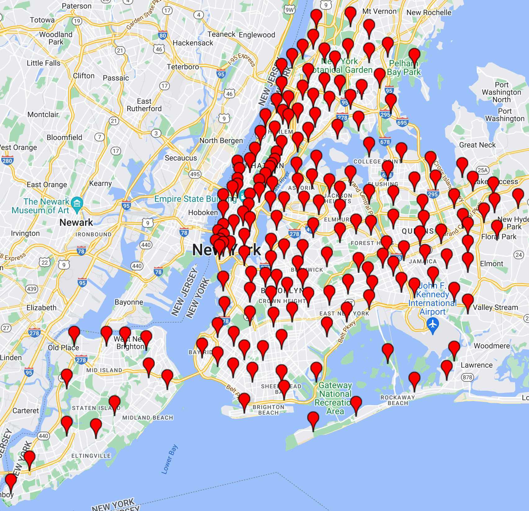
I wanted to use Google Maps to find areas that are under-served by public transit. To this end, I got the time it takes to travel from every one of NYC’s 181 zip codes to every other NYC zip code by walking, driving, or taking public transit. I ignored pins over water, using the handy OnWater API, resulting in the following map:
Summary Stats
Unsurprisingly, driving was (overwhelmingly) the fastest way to get anywhere. Of the 15,731 location combinations I evaluated, walking was as fast as driving in 3 cases (0.02%), and faster than transit in 54 cases (0.3%). Meanwhile, transit was faster than driving in 111 cases (0.7%). The absolute longest drive time between two points is from Great Kills, Staten Island to Edenwalk in the Bronx, at 1 hour and 7 minutes, whereas the longest transit is between Pleasant Plains, Staten Island and Glenn Oaks in Queens, taking 3 hours and 28 minutes.
Finding Under-Served Communities
We can find under-served communities by plotting the drive time vs. the transit time between two points. The higher the point is on the graph, the longer it takes to drive between the two points, and the further to the right a point is on the graph, the longer transit takes from point A to point B. This means any dot lower than the two red lines is under-served (transit takes much longer than driving), whereas dots above the two red lines are better served (the drive / transit time ratio is smaller).

Using this information, we can then find which areas are over-represented in the under-served and well-served communities. Remarkably, up to 35% of distances of under-served communities were below both red lines, whereas up to 43% of distances of well-served communities were above both red lines, strongly suggesting systematic under- and over-service of certain communities.
There was a stark difference in location between the under- and well-served communities, with most of the well-served communities being in Brooklyn (left), whereas most of the under-served communities were in Queens (right):

Transit Service by Ethnicity
I used NYC Open data to get the demographics of each NYC zip code, only keeping the zip codes whose demographic percentages were known and complete. Doing so revealed that the well-served communities were overwhelmingly white, whereas Hispanic Latino communities were the most under-served, followed by Black Non-Hispanic communities.

Transit Service by Annual Income
I used NYC’s Citizens’ Committee’s annual income data to determine whether this inequity was strictly racial, or if it extended to income as well. While none of the categories of income achieved statistical significance, under-served communities all had a lower average income than well-served communities. This could be indicative of systemic under-service of lower income areas, however the effect is much smaller than that of the over-service of white communities and under-service of Hispanic Latino communities.
